NT TRADING: A GLOBAL IDENTITY IN MOTION
A global trading company for trucks & trailers, with branches in Sweden, Spain, and the USA.
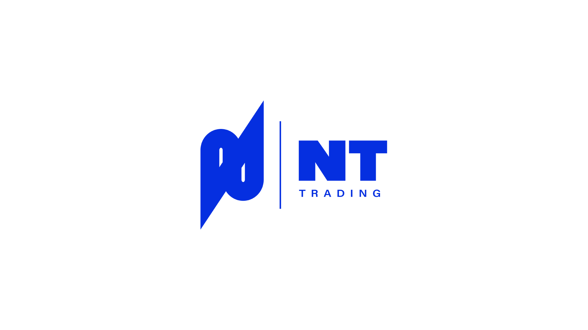
The new identity for NT Trading is a modern evolution of their original logotype. The legacy logo featured a rounded “N” symbolising roads and routes, a direct nod to their transport roots.
In the redesigned version, the abstract mark builds on that foundation while introducing a more elevated and scalable aesthetic. The new symbol connects the ends of the "N" into a continuous path, inspired by contour lines often found in cartography, used to visualise elevation and terrain.
This layered design not only hints at global topography and expansion but also gives a subtle 3D effect, referencing the idea of movement, growth, and direction, key values for a cross-continental logistics brand.


