NOT AFRAID TO OVERSHARE: BRAND IDENTITY FOR MIKE S
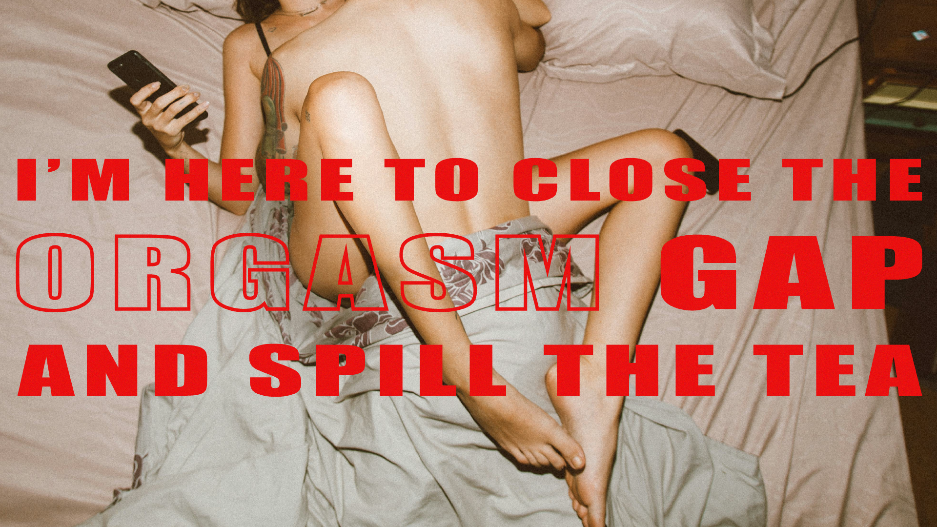
Mike S is a Substack newsletter about the London dating scene, written by a woman, despite the misleading name. Each week, she shares bold, intimate stories straight from her love life, delivered with sharp humour and unfiltered honesty.
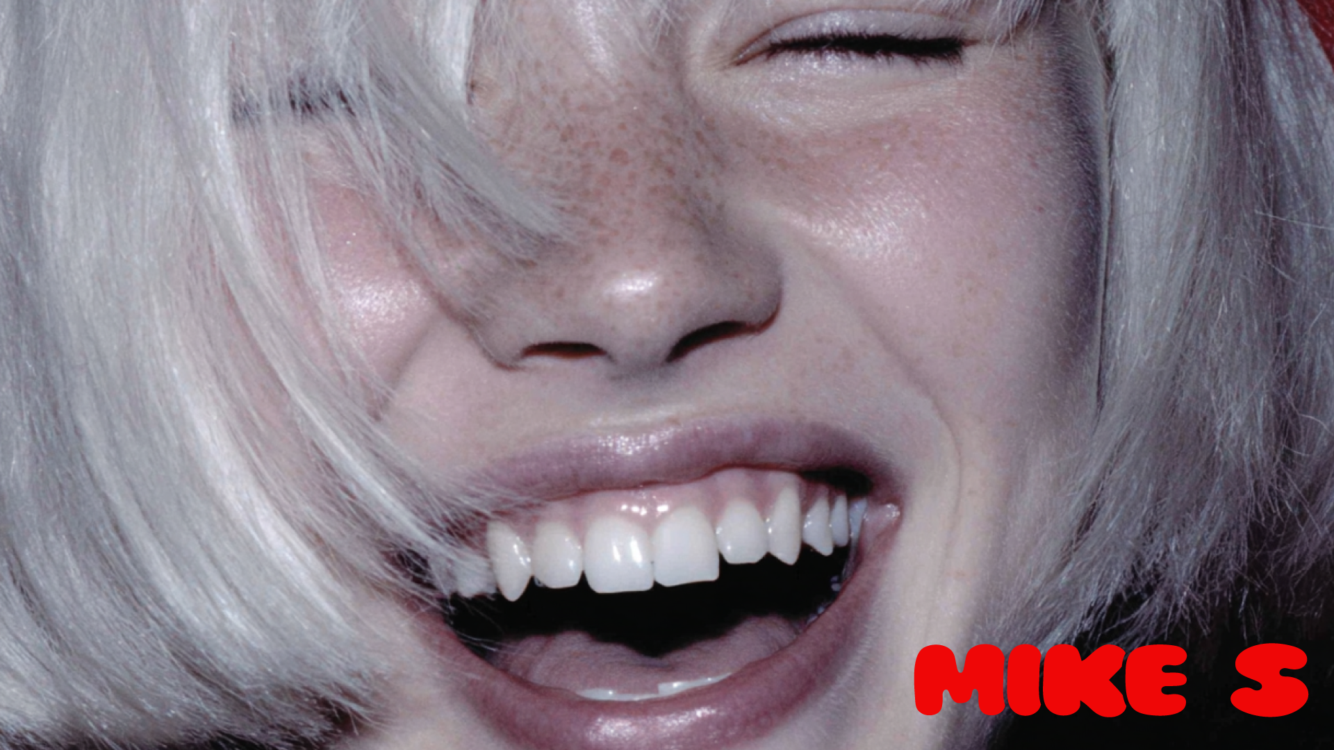
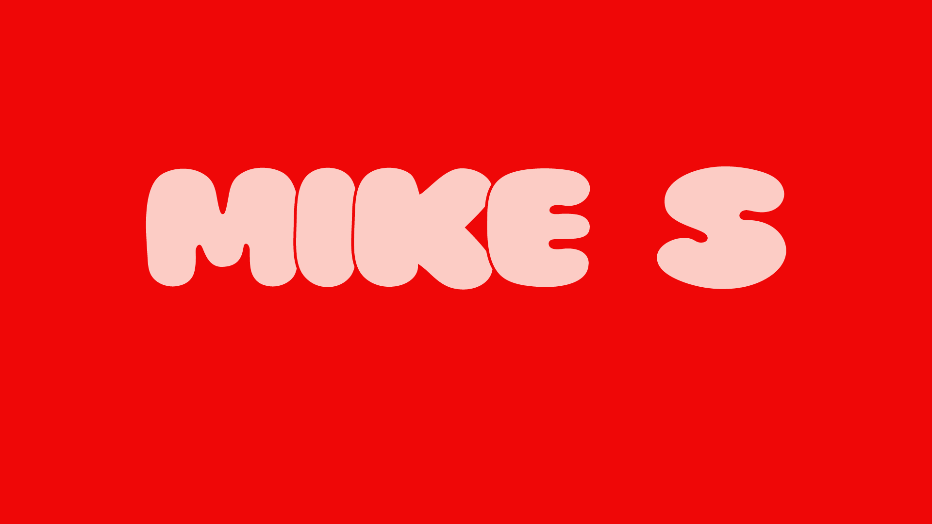
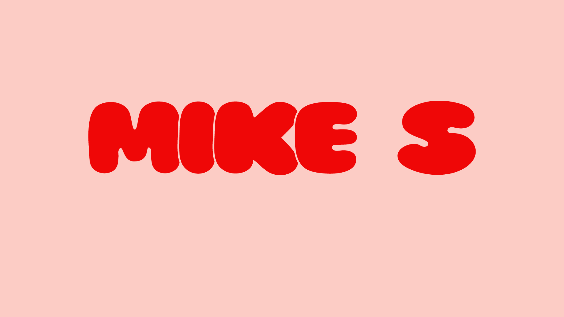
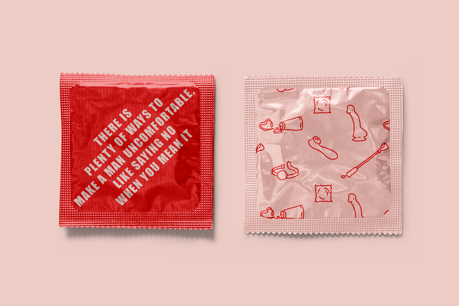
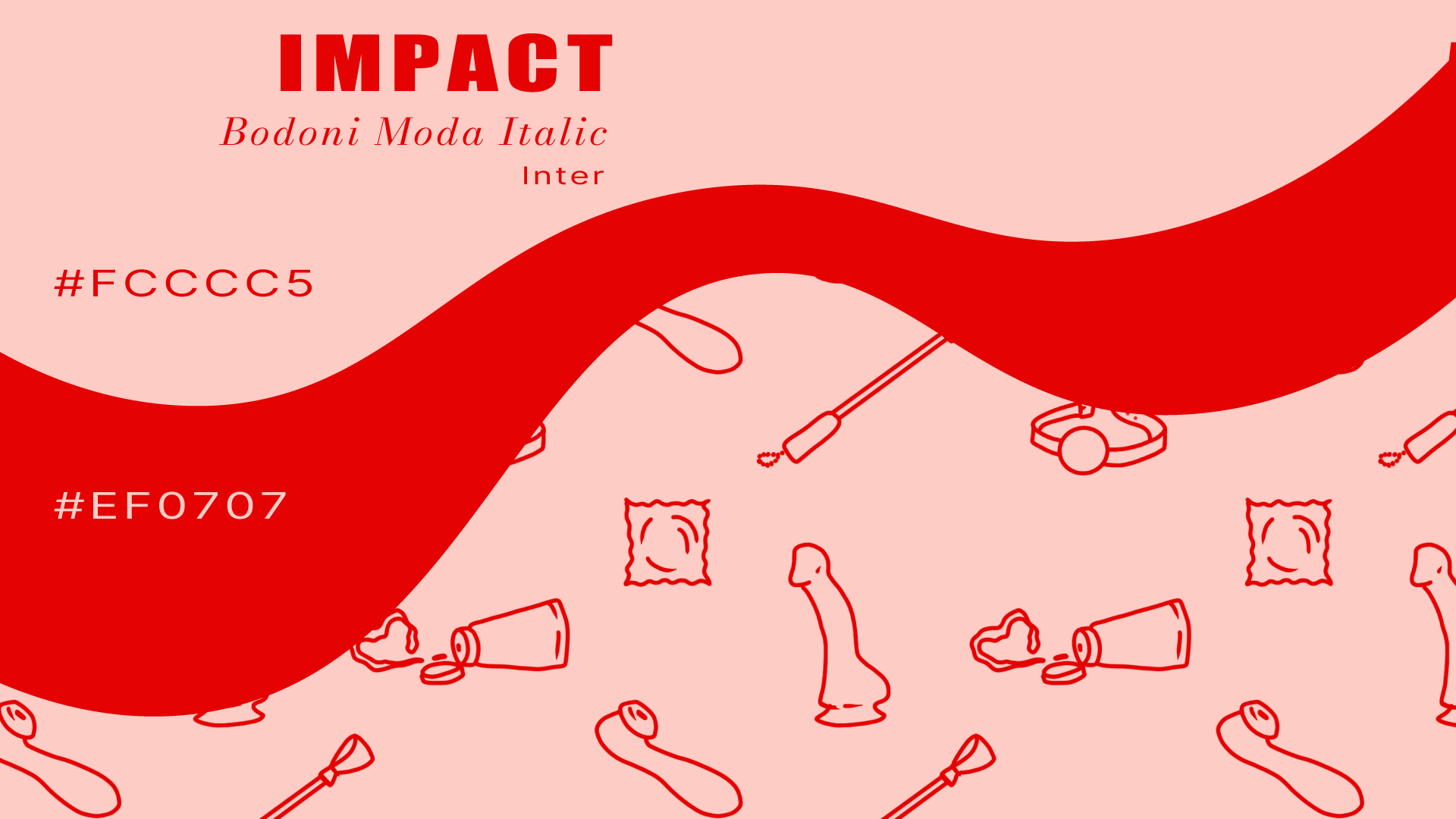
I created the full visual identity, playing with contrast to mirror the writing’s tone: on one side, it’s fearless and in-your-face; on the other, soft, reflective, and deeply personal. The round sans-serif logo gives the project a cutesy feeling, while the bright colour palette brings confidence and attitude.
The design is simple but intentional, letting the words take center stage while building a clear and memorable brand around them. It’s feminine, a little provocative, and doesn’t take itself too seriously.
Mockups by Creavora.
Photography by Roman Odintsov & Anna Shvets via Pexels.
Photography by Roman Odintsov & Anna Shvets via Pexels.